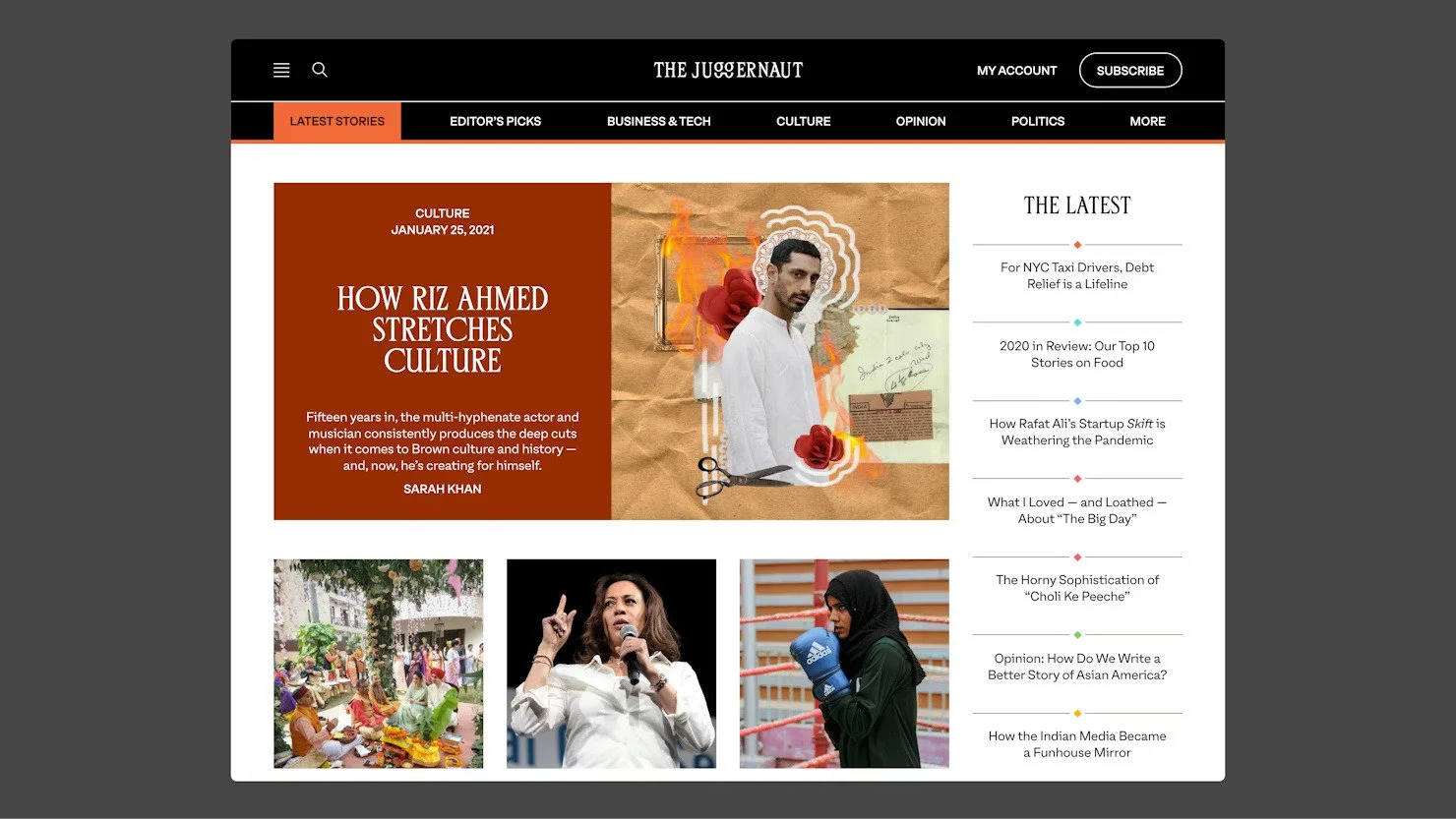
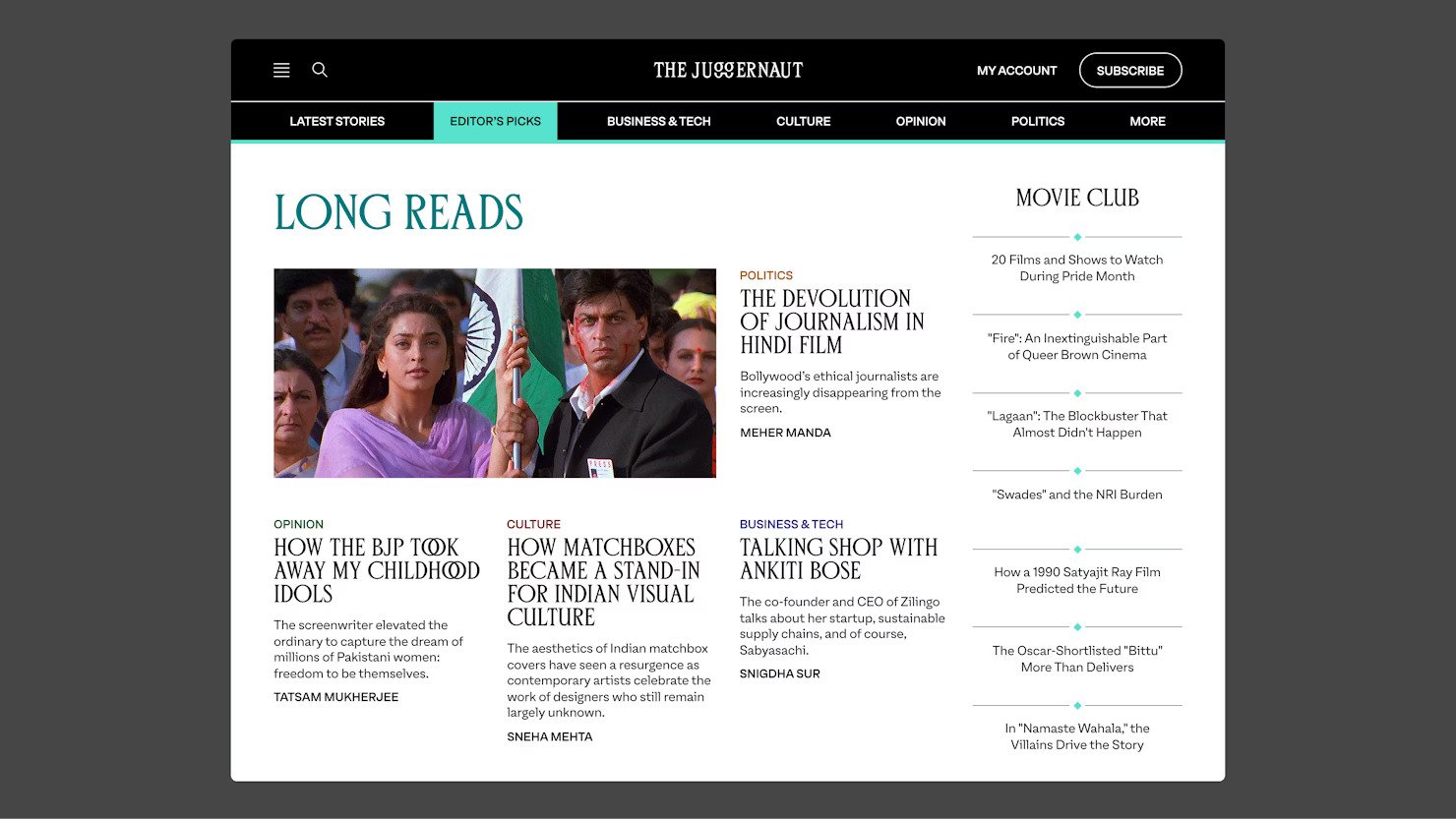
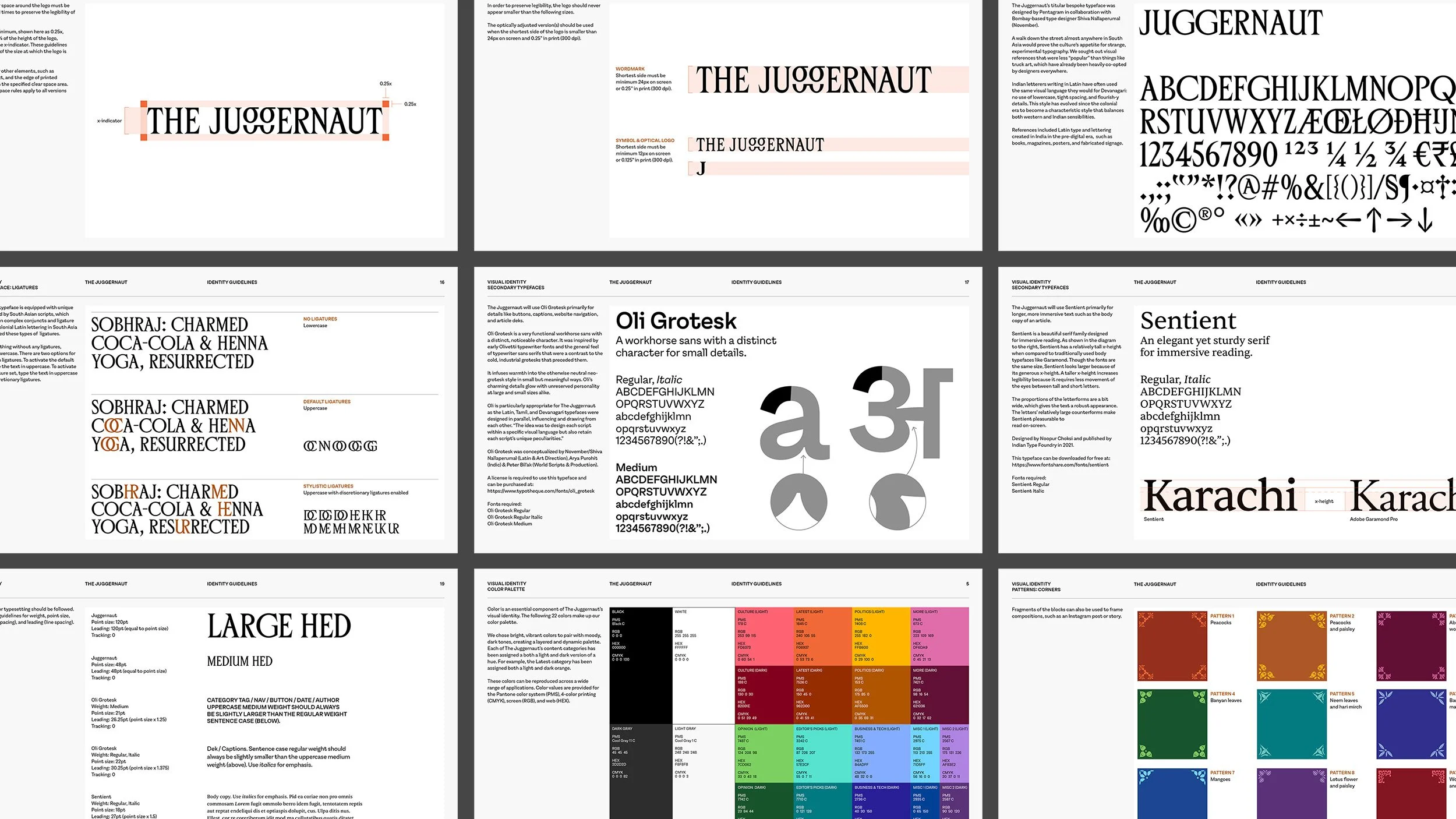
As The Juggernaut expanded into new marketing platforms, its existing brand identity lacked the flexibility required to support growth across its primary touchpoints, including the website and app. They partnered with our team to evolve the visual system into one that could scale confidently while remaining culturally rooted.
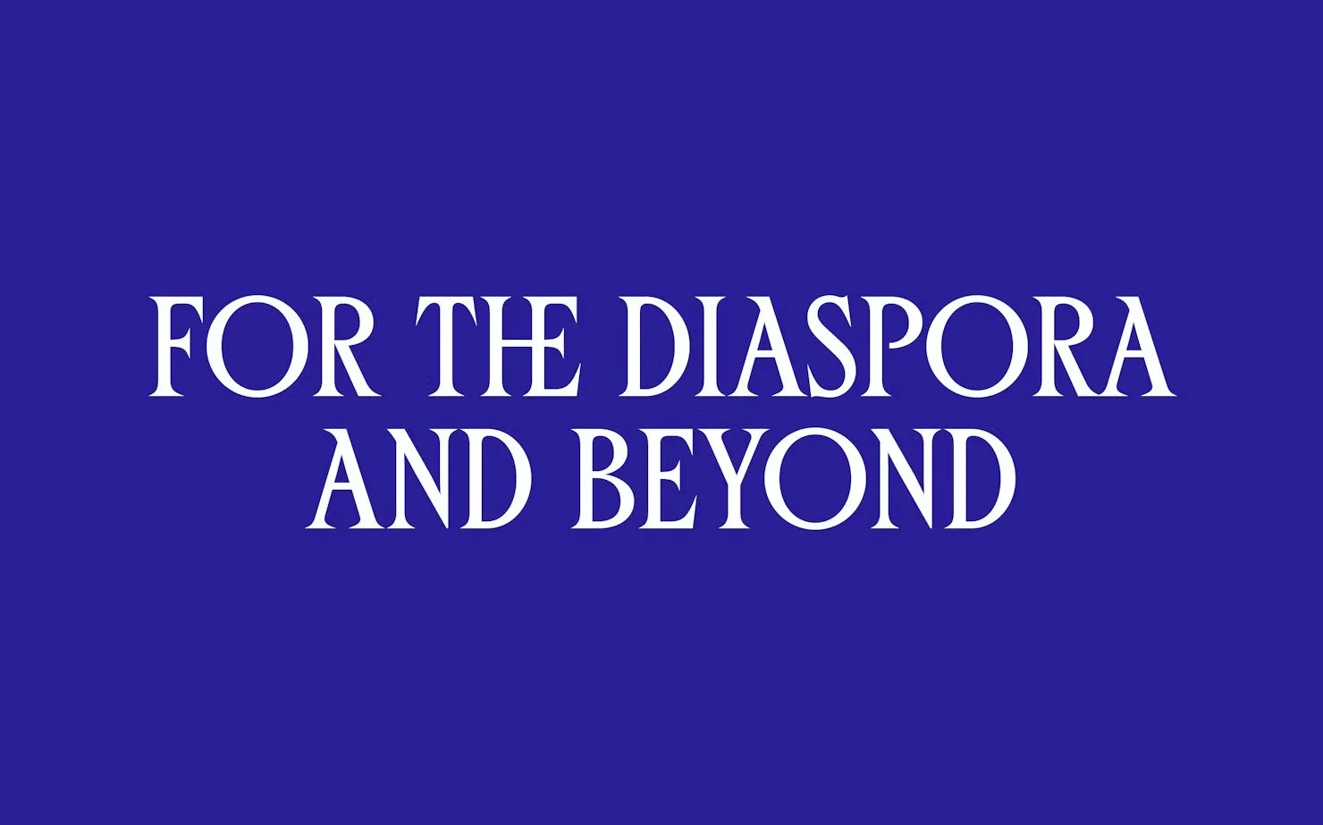
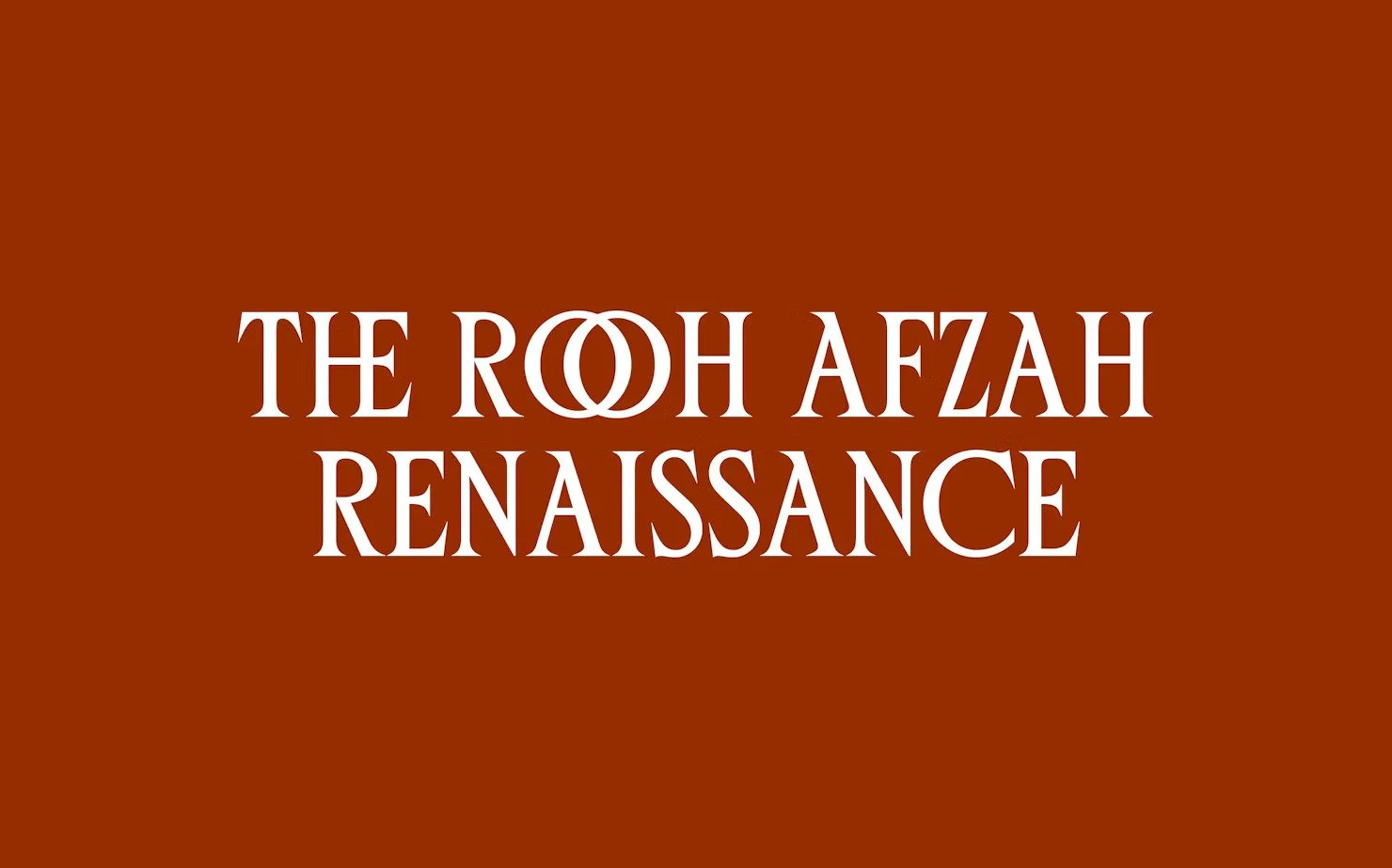
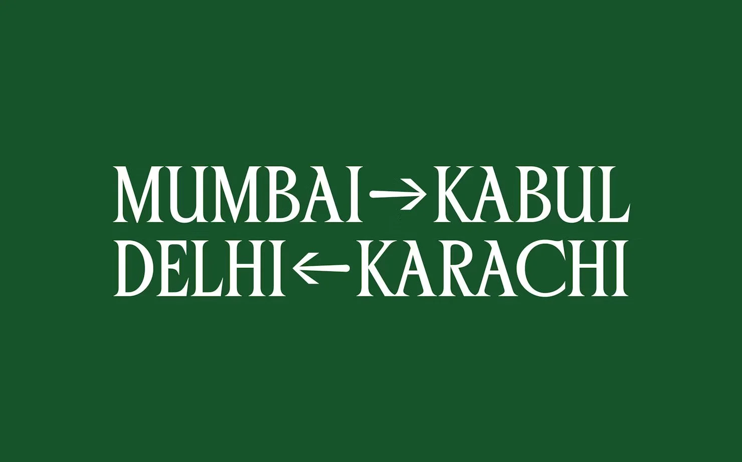
The renewed visual identity was grounded in South Asian street culture—especially its vernacular typography and distinctive color relationships. Rather than leaning on decorative cultural references, our approach focused on how color and letterforms function in everyday South Asian urban environments.
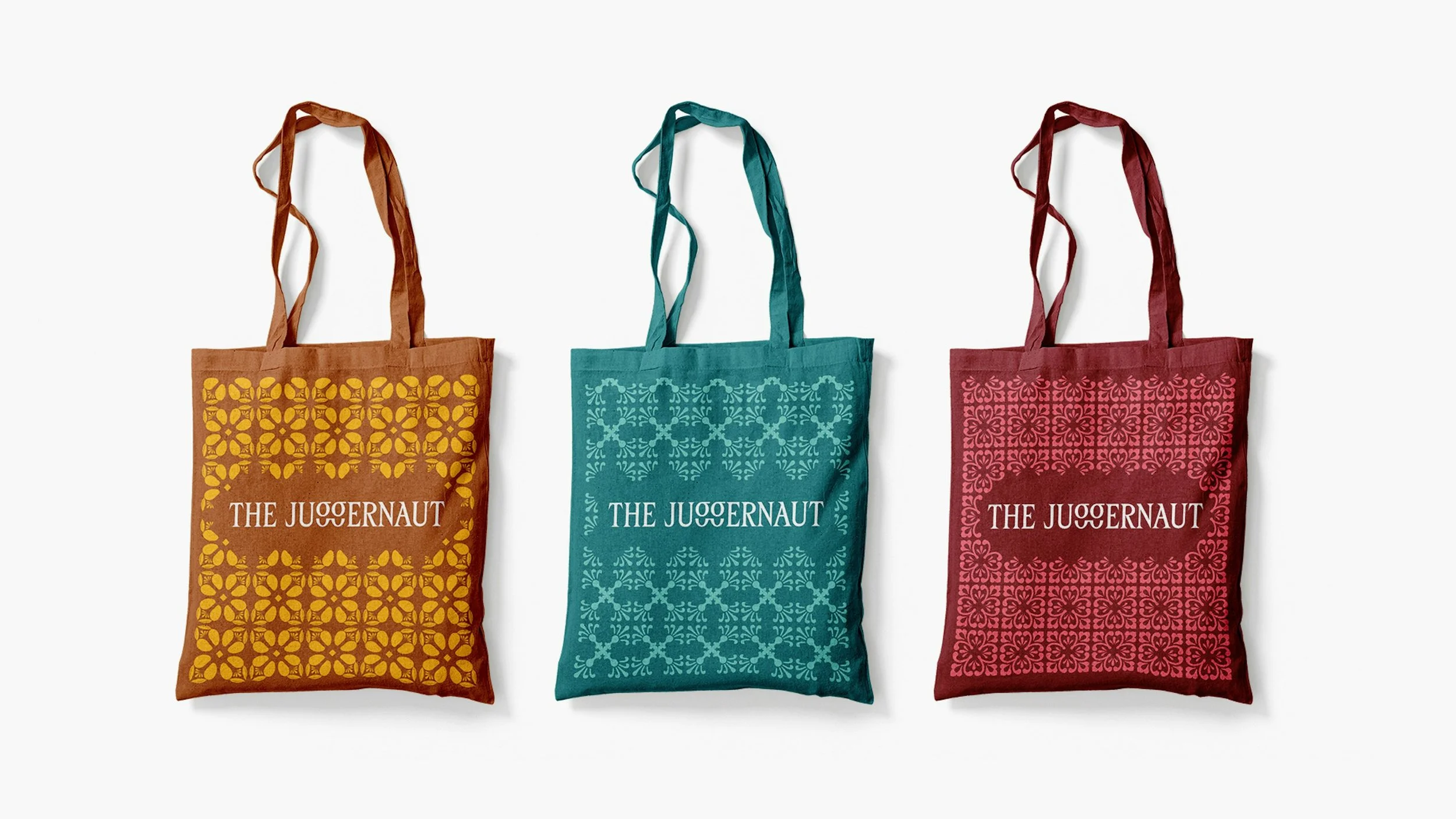
A tone-on-tone palette, inspired by street signage, brought this direction to life—where saturated high-contrast hues coexist with slightly muted tones. This method created a layered, energetic visual rhythm that feels authentically South Asian yet editorially refined.
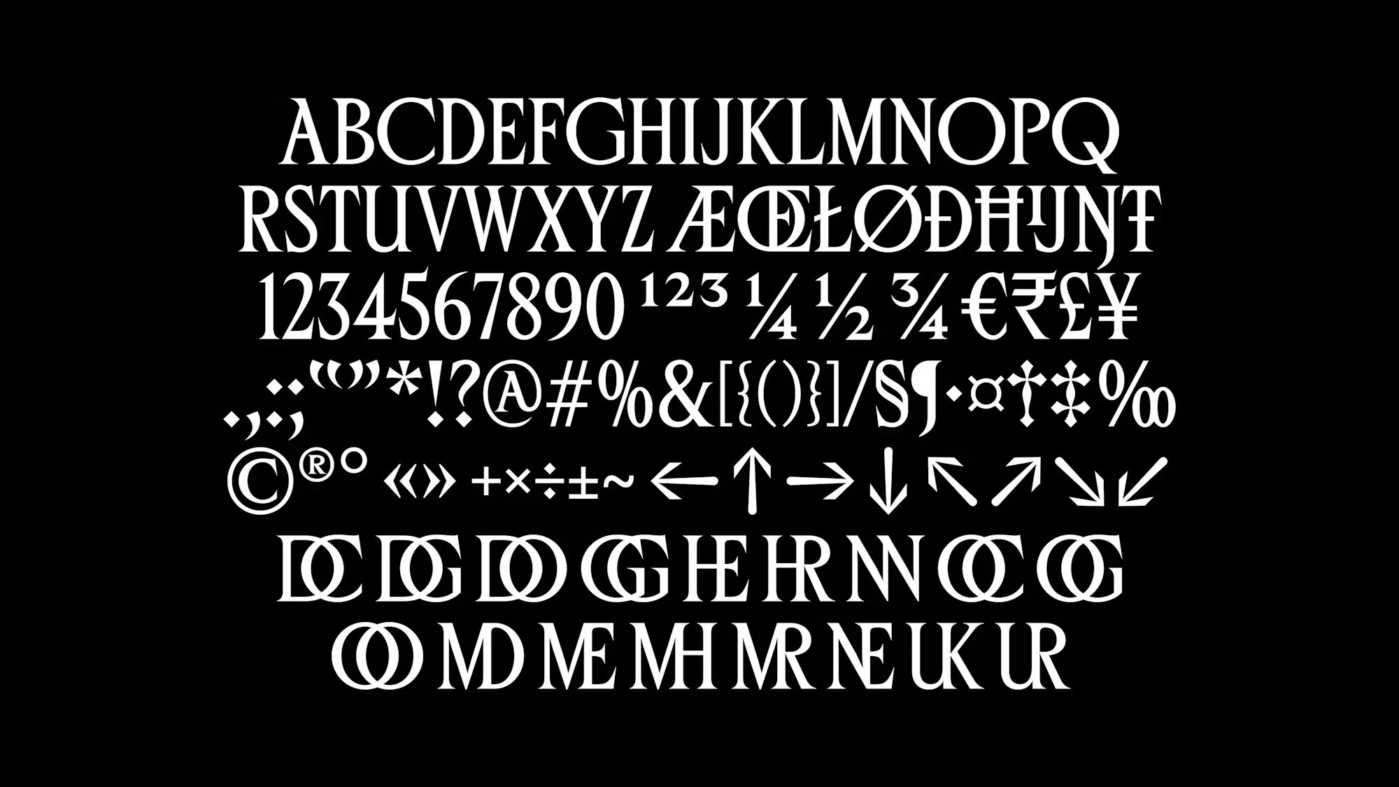
We also developed a custom brand typeface informed by South Asian letterforms and typographic structures. Typography and color pairing became the defining elements of the visual language, forming a flexible system capable of expanding across digital products, editorial content, and future brand extensions.
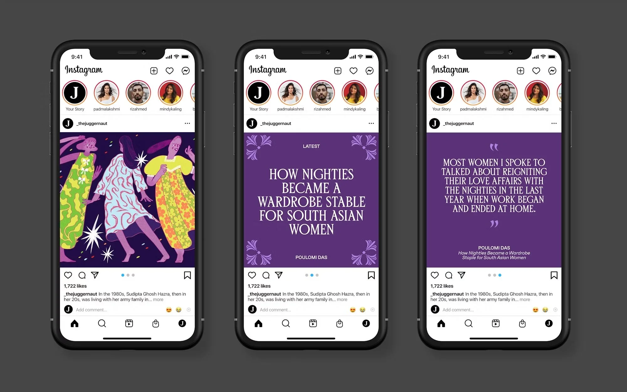
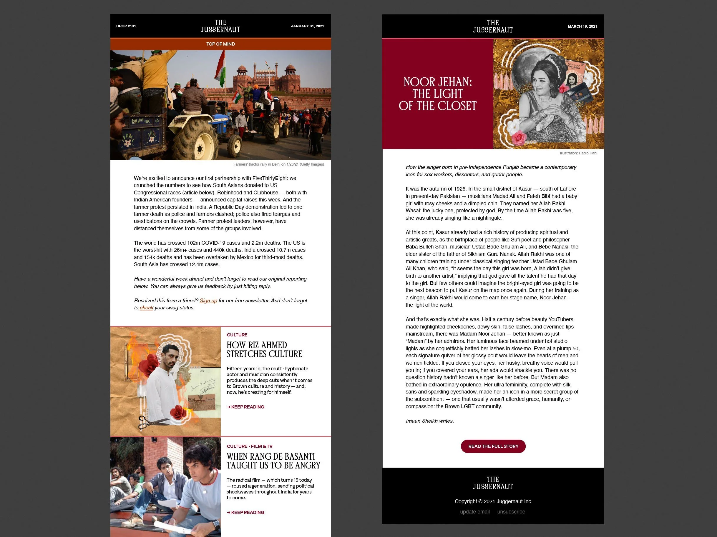
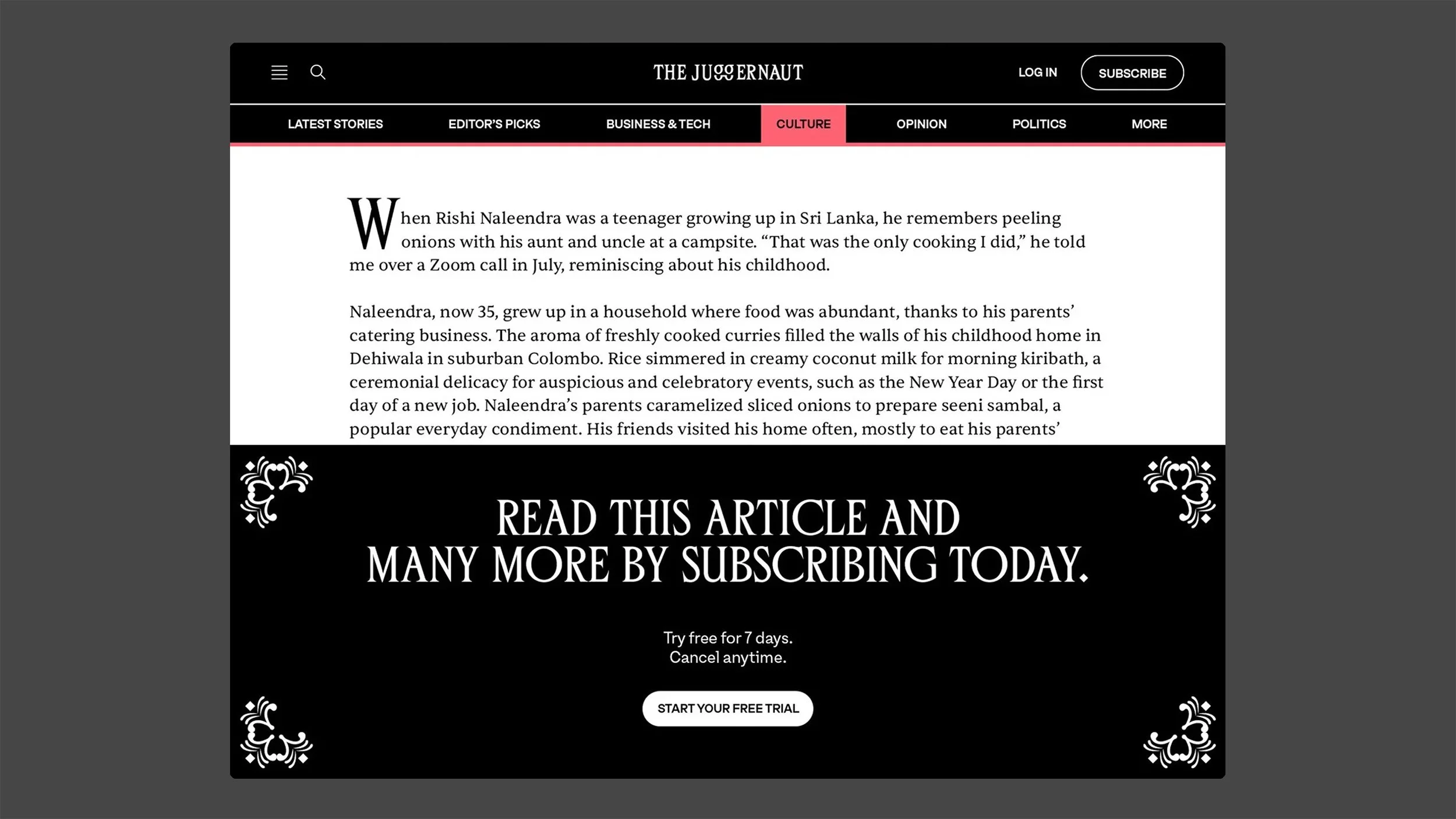
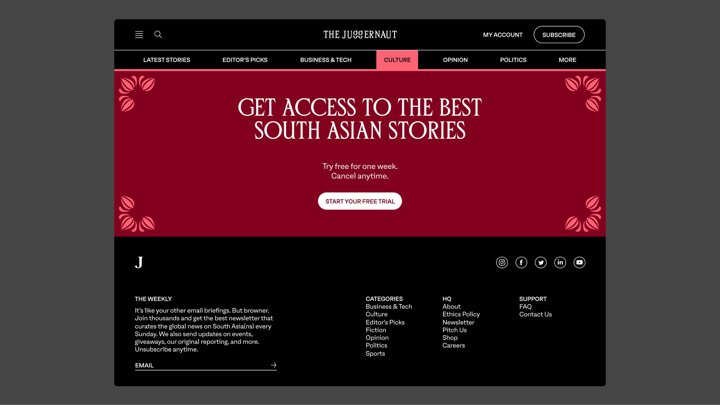
The website and app became direct expressions of this renewed identity. Through deliberate typographic hierarchy, color interaction, and modular composition, the interface allowed the brand’s character to lead the experience—removing previous constraints and enabling a more scalable and confident presence.