Hotel Tamanaco Caracas is a historic luxury hotel founded in 1953 and long regarded as an icon within Caracas, Venezuela’s cultural memory and tourism history. Its architecture and exterior signage have served for decades as visual landmarks and emotional touchpoints for the city and its community.
However, multiple ownership changes and operational shifts left key brand touchpoints — from signage and logo to color and typography — without a cohesive system, resulting in fragmented expressions that weakened the hotel’s symbolic presence and overall brand equity.
Rather than focusing solely on aesthetics, we worked closely with the client to assess how this fragmentation was impacting customer experience and emotional connection. The design process became a strategic exercise in determining which brand assets to preserve, which to leave behind, and how to clarify the hotel’s identity to engage a new generation of guests.
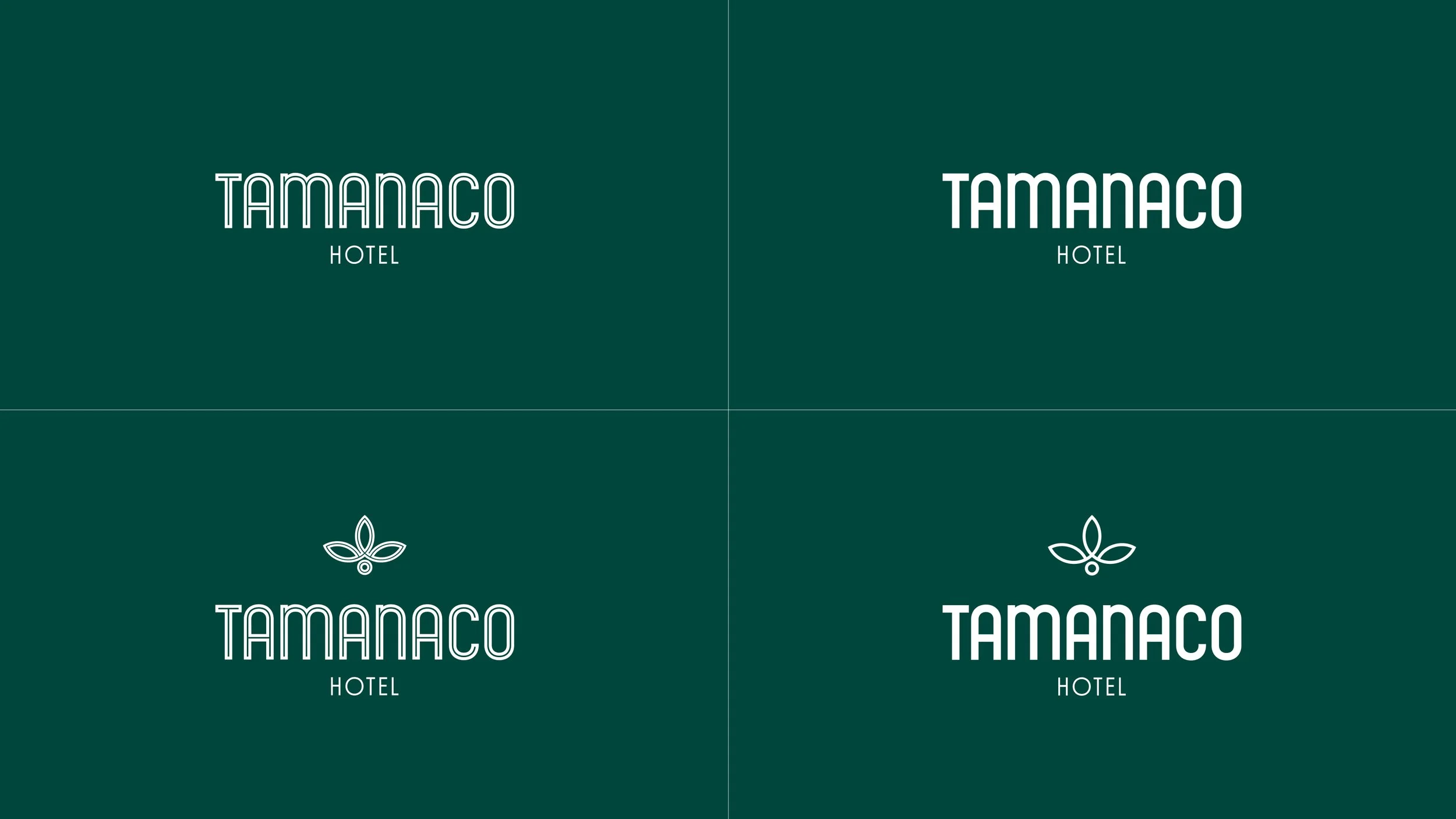
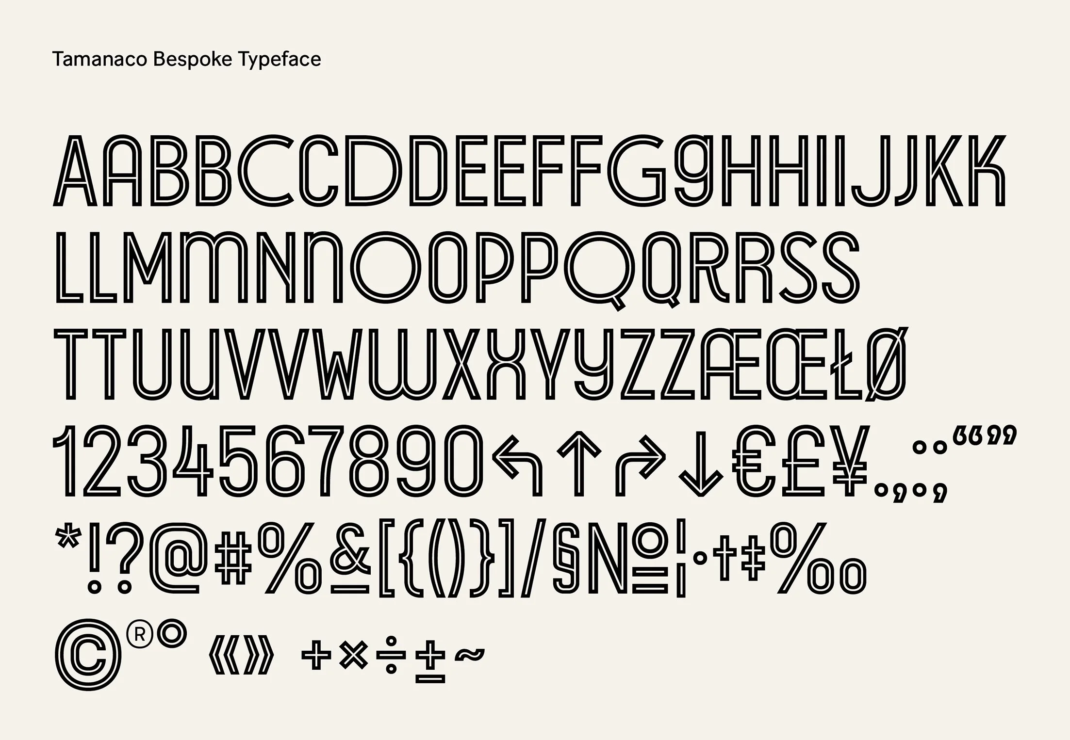
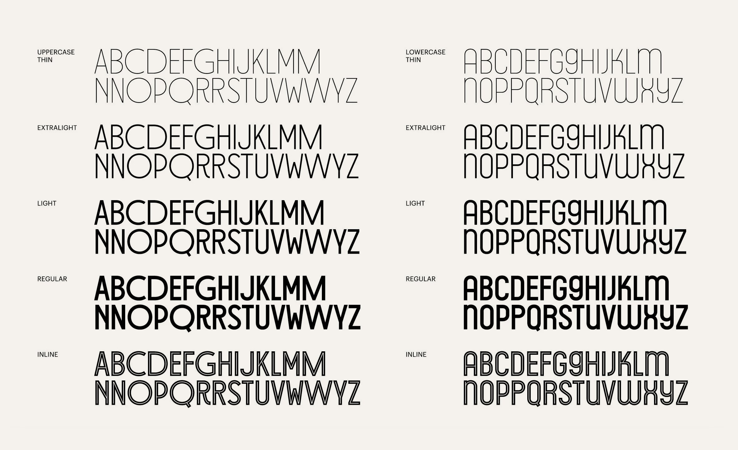
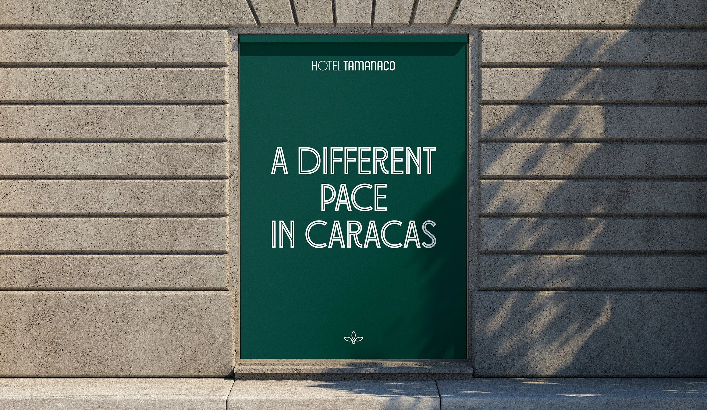
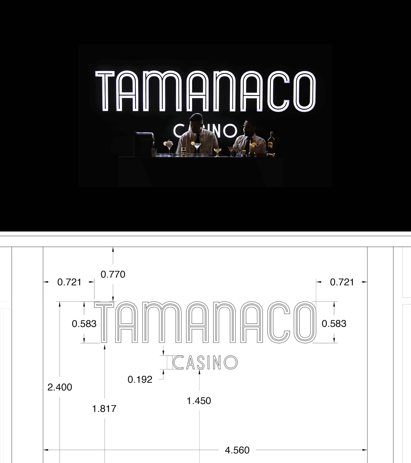
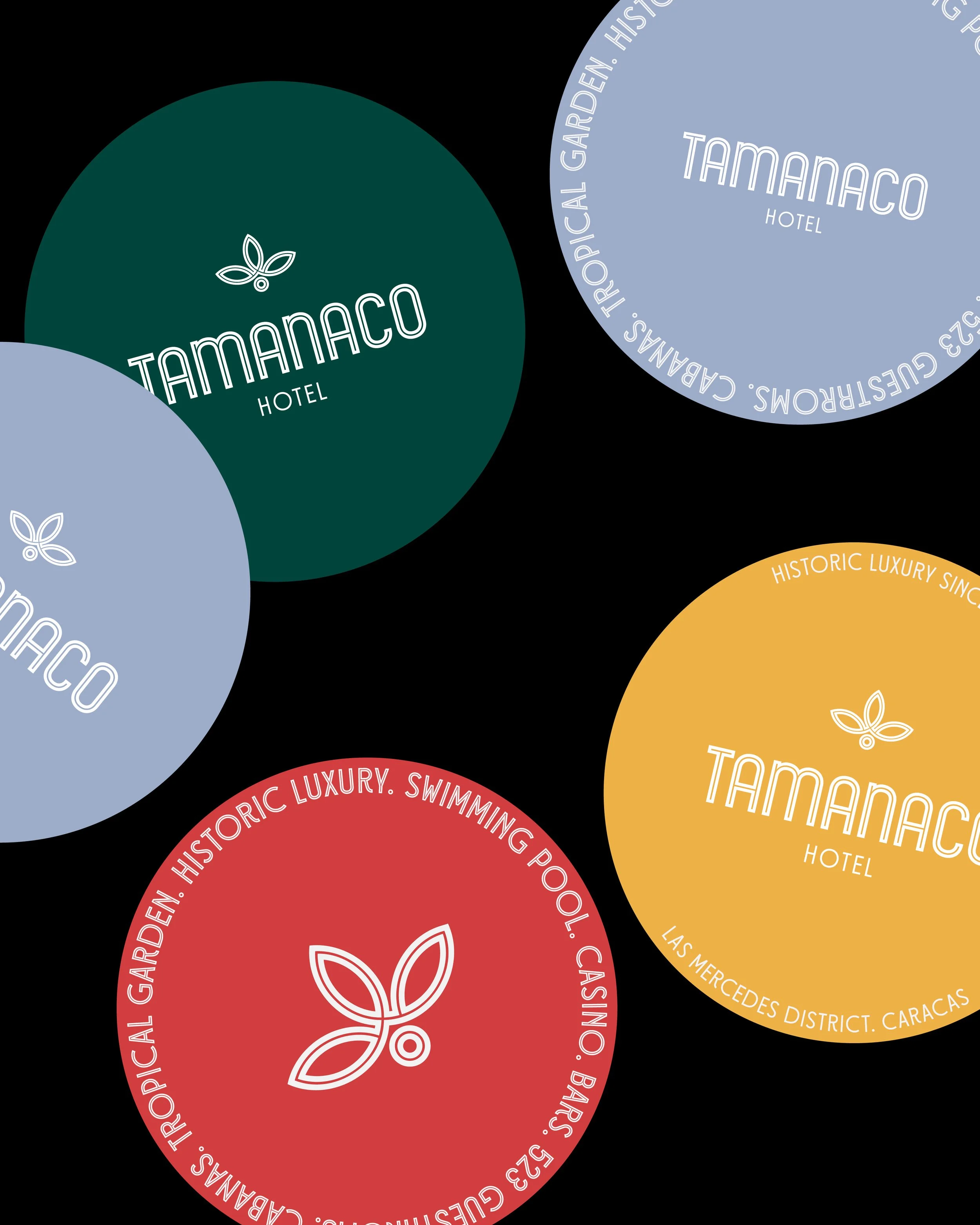
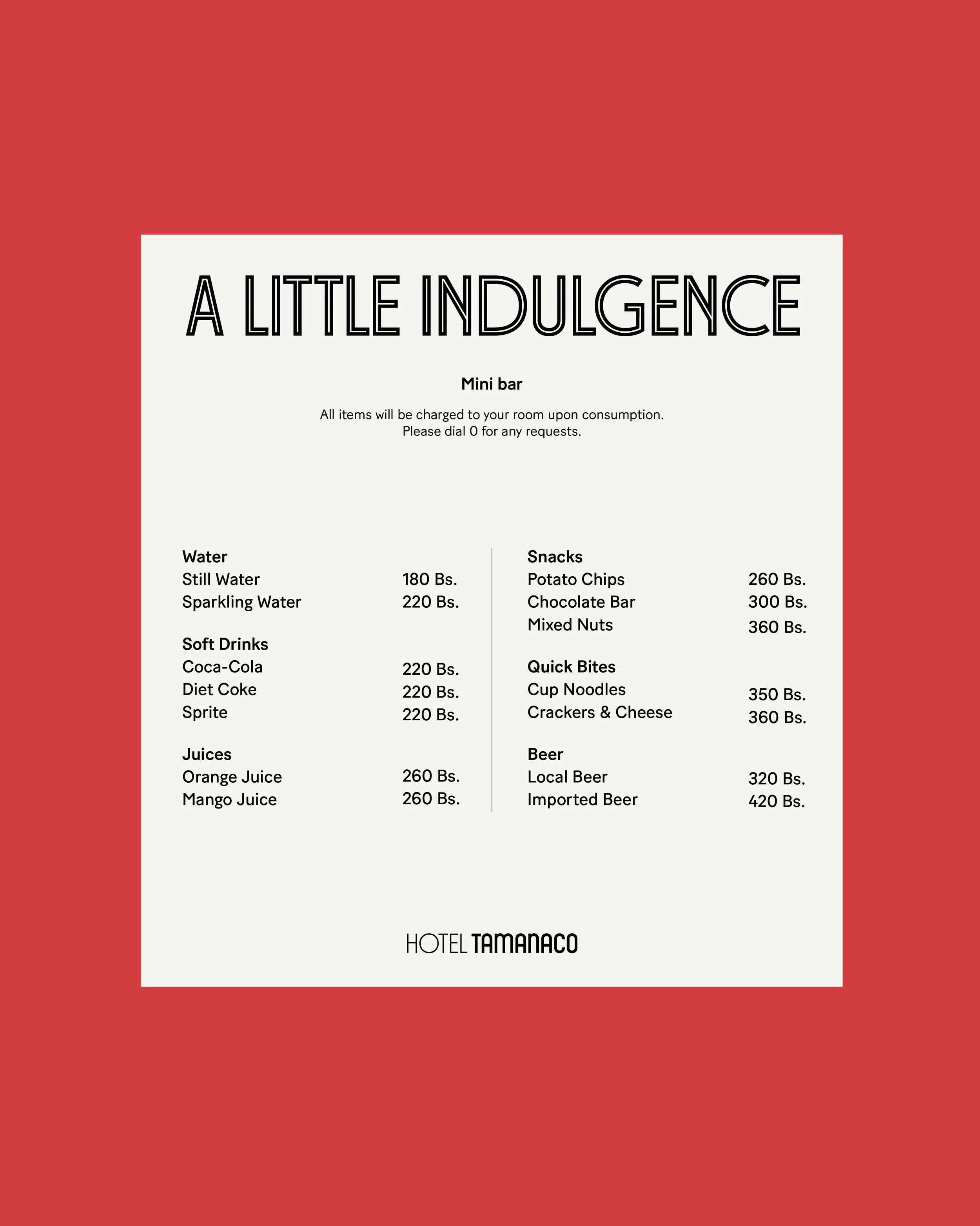
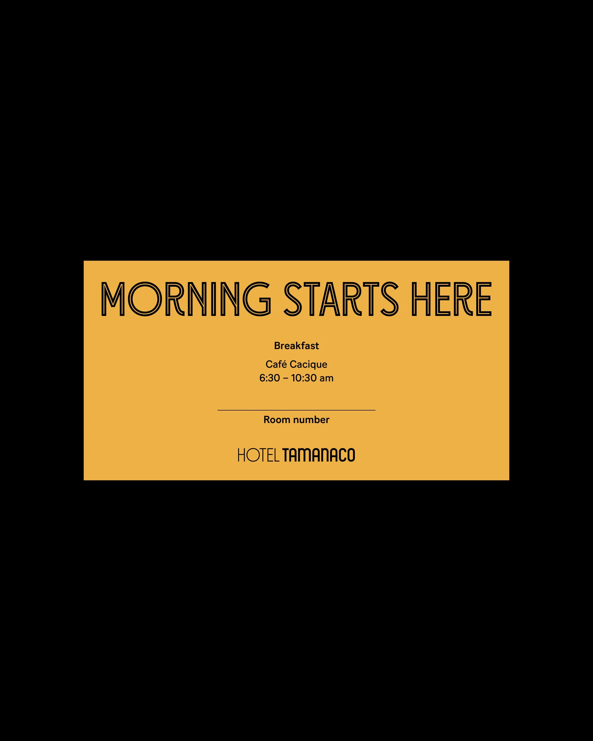
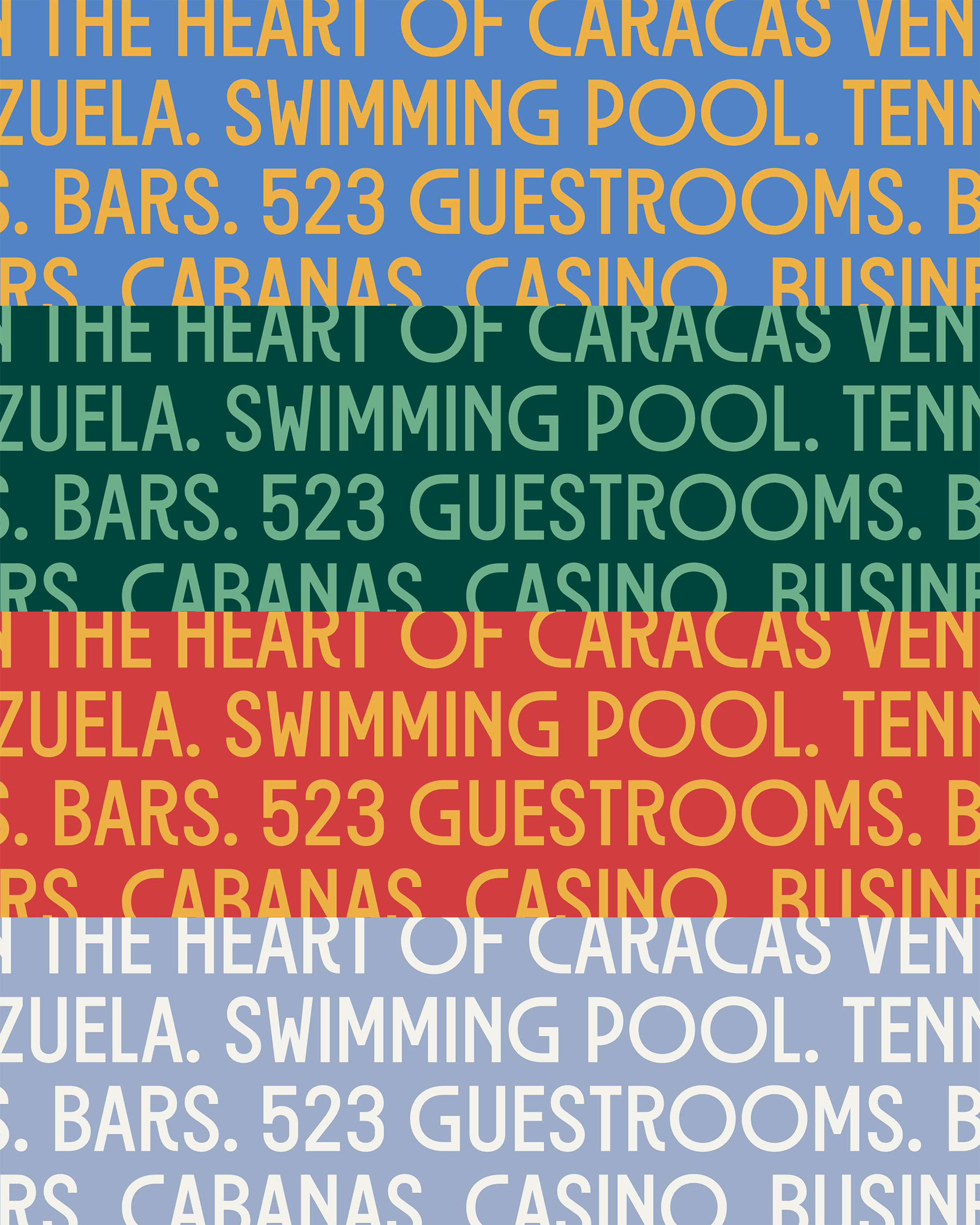
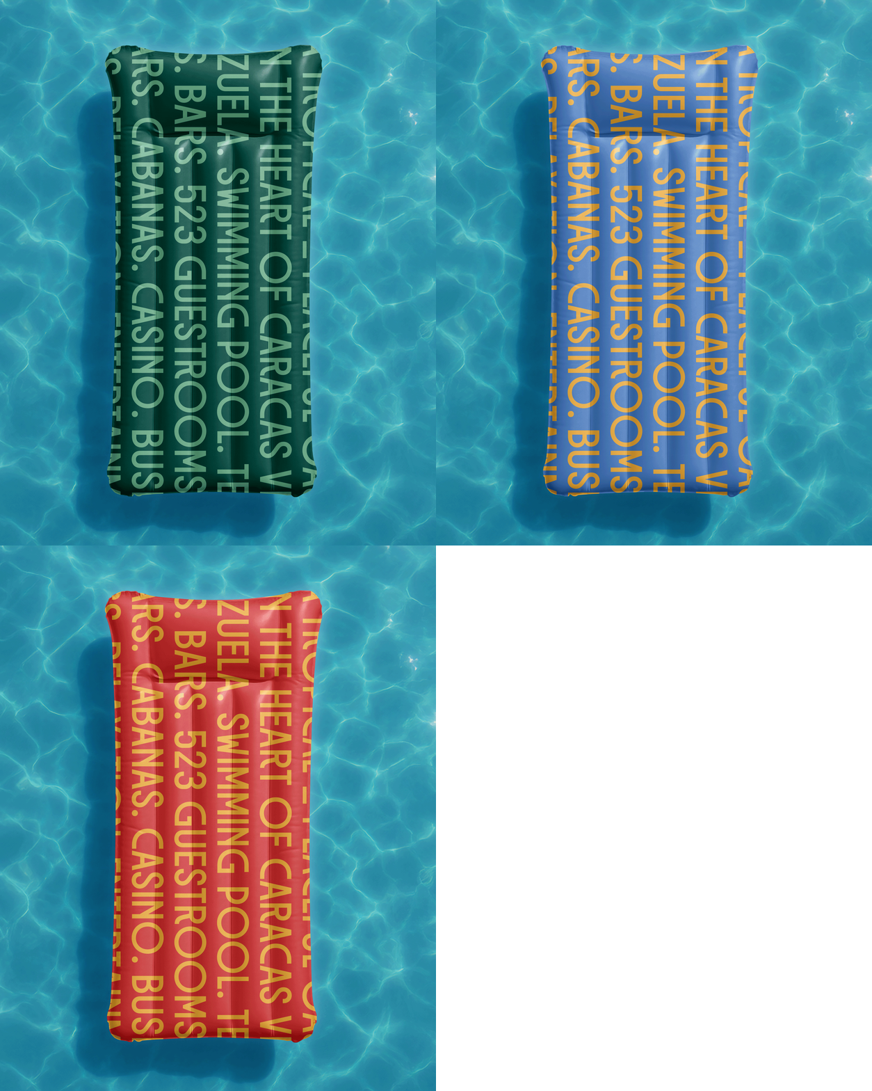
Our approach reinterpreted the hotel’s nostalgic character through a contemporary lens, retaining key elements — including the original signage proportions and Art Deco influence — and translating them into a cohesive brand system built for modern and digital consistency. Rather than revisiting heritage, the strategy repositioned it as renewed brand equity, strengthening both identity clarity and guest experience.
